
In this post I will show how to customize the title and header section of the Tabbed Page control, when running on Windows Phone. On WP this is the pivot control being used, which is quite different from the tabs used on both iOS and Android.
Let’s say you wish to just change the font or completely restyle the title or the header showing the sections. You can create the complete page as a native Windows Phone XAML page with a pivot control and let that render. This gives complete control of the page and the pivot control, but makes the sacrifice of reducing how much code is shared.
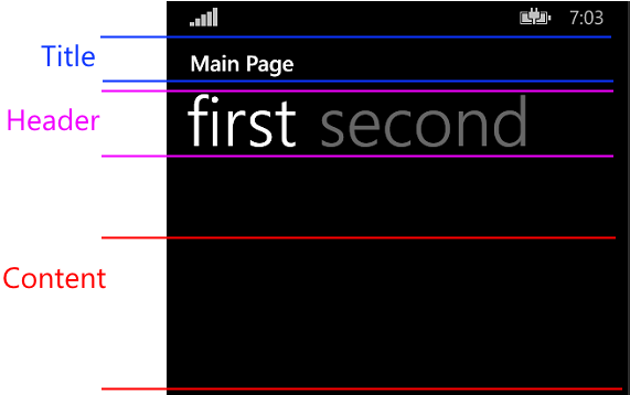
The basic elements of the pivot is illustrated below. With Xamarin Forms, the content area renders the content of the selected page. The title and header uses the default pivot title and header templates which is basically a TextBlock showing the Title property of the data context. Lets modify this and change the font and make the title text larger than the header.
First create a class that derives from TabbedPage in the shared project / PCL – it may be as simple as the following:
public class StyledTabbedPage : TabbedPage
{
}
On any page you wish to use the styled one, derive from StyledTabbedPage instead.
In the Windows Phone project, create the class StyledTabbedPageRenderer that derives from TabbedPageRenderer. In addition, put the ExportRenderer attribute outside the namespace that instructs Xamarin to use the class when rendering the StyledTabbedPage control:
[assembly: ExportRenderer(typeof(StyledTabbedPage), typeof(StyledTabbedPageRenderer))]
namespace App1.WinPhone
{
    public class StyledTabbedPageRenderer : TabbedPageRenderer {
    // ...
    }
}
If we look at the definition of the TabbedPageRenderer on Windows Phone we can see it is deriving from the Pivot control:
public class TabbedPageRenderer : Pivot, IVisualElementRenderer, IRegisterable
When the instance of StyledTabbedPageRenderer is created instead of the default TabbedPageRenderer this will be the pivot control itself. Here we can access the template properties. The OnElementChanged override provides one to modify the control after setup. The following changes the title and header by constructing a new data template for the TitleTemplate and HeaderTemplate properties:
protected override void OnElementChanged(VisualElementChangedEventArgs e)
{
    base.OnElementChanged(e);
    this.TitleTemplate = GetStyledTitleTemplate();
    this.HeaderTemplate = GetStyledHeaderTemplate();
}

private DataTemplate GetStyledTitleTemplate()
{
    string dataTemplateXaml =
    @"<DataTemplate
    xmlns=""http://schemas.microsoft.com/winfx/2006/xaml/presentation"
    xmlns:x=""http://schemas.microsoft.com/winfx/2006/xaml"">
    <TextBlock
        Text=""{Binding}""
        FontFamily=""Segoe UI""
        FontWeight=""Light""
        Foreground=""Red""
        FontSize=""90"" />
    </DataTemplate>";

    return (DataTemplate)XamlReader.Load(dataTemplateXaml);
}

private DataTemplate GetStyledHeaderTemplate()
{
    // Pretty much the same as for GetStyledTitleTemplate // Except the binding expression is {Binding Title}
}
Note that by default, the Title property itself of the StyledTabbedPage instance is the context for the title element, whereas the child page instance is the instance for the header element. This is the reason that Line 16 is simply a binding directly to the context, whereas the binding expression for the header template must have the Title path added (or any other property you want to write out in the header).